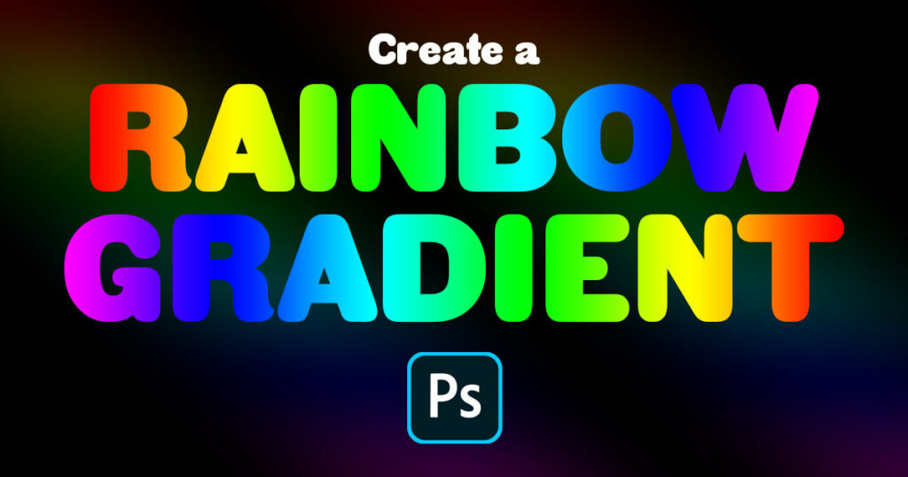
Chasing Rainbows: A Comprehensive Guide on How to Create a Rainbow Gradient in Photoshop
Introduction:
In the vibrant world of digital design, gradients play a pivotal role in adding depth, dimension, and a splash of color to compositions. Among the myriad gradient possibilities, creating a rainbow gradient stands out as a whimsical and joyful endeavor. This comprehensive guide takes you on a creative journey, unraveling the steps and techniques to craft a stunning rainbow gradient in Photoshop. Whether you’re a seasoned designer or a curious beginner, let’s embark on a colorful adventure through the spectrum of possibilities.
I. Understanding the Anatomy of a Rainbow:
1.1 The Symbolism of Rainbows:
- Rainbows are universal symbols of hope, diversity, and positivity.
- Understanding the natural order of colors in a rainbow – red, orange, yellow, green, blue, indigo, and violet – forms the foundation for creating a digital representation in Photoshop.
1.2 Recreating Nature Digitally:
- In Photoshop, the process involves mimicking the gradient of colors seen in a natural rainbow.
- By creating a gradient that seamlessly transitions through the colors of the spectrum, designers can evoke the enchanting beauty of a rainbow in their digital creations.
II. Setting Up Your Canvas:
2.1 Creating a New Document:
- Open Photoshop and create a new document to serve as the canvas for your rainbow gradient.
- Choose the dimensions that suit your design requirements, ensuring a space wide enough to showcase the full spectrum of colors.
2.2 Selecting the Gradient Tool:
- Access the Gradient Tool in the toolbar, usually located on the left side of the screen.
- The Gradient Tool icon resembles a rectangle transitioning from one color to another.
III. Configuring the Rainbow Gradient:
3.1 Choosing the Gradient Type:
- In the options bar at the top of the screen, locate the gradient picker.
- Select the default gradient (foreground to background) or explore other gradient presets, such as the spectrum gradient.
3.2 Customizing the Gradient Colors:
- Click on the gradient preview to open the Gradient Editor.
- Manually configure the gradient by adding color stops for each hue of the rainbow. Adjust the color stops to reflect the order and intensity of colors in a traditional rainbow.
IV. Utilizing Gradient Styles:
4.1 Linear Gradient:
- The default gradient style is often set to linear, creating a straightforward transition from one color to the next in a straight line.
- Adjust the angle of the gradient if you wish to change the direction of the color transition.
4.2 Radial Gradient:
- Experiment with the radial gradient style for a circular or elliptical transition.
- This style can create a focal point in the center, allowing colors to radiate outward in a circular pattern.
4.3 Angle Gradient:
- The angle gradient style provides a dynamic diagonal transition, enabling designers to infuse a sense of movement or perspective into their rainbow gradients.
- Explore different angle settings to find the most visually appealing arrangement.
V. Adding Vibrancy and Saturation:
5.1 Adjusting Color Vibrancy:
- Enhance the vibrancy of your rainbow gradient by adjusting the saturation and brightness of individual color stops.
- Experiment with vibrant, saturated colors to capture the lively essence of a real rainbow.
5.2 Incorporating Gradient Opacity:
- Introduce a subtle touch by adjusting the opacity of the gradient.
- This step allows for nuanced transitions between colors, creating a softer and more ethereal rainbow effect.
VI. Experimenting with Blending Modes:
6.1 Overlay and Soft Light:
- Try blending modes like Overlay or Soft Light to blend the rainbow gradient seamlessly with the background or other elements in your design.
- Blending modes add depth and richness to the colors, enhancing the overall visual impact.
6.2 Color and Hue Blending:
- Explore color and hue blending modes for unique and unexpected results.
- These modes can introduce interesting color interactions and variations, contributing to the creative flair of your rainbow gradient.
VII. Incorporating Additional Effects:
7.1 Adding Texture:
- Elevate your rainbow gradient by incorporating subtle textures or patterns.
- Layering textures can introduce depth and dimension, giving your rainbow a more tactile and organic appearance.
7.2 Gaussian Blur for Softness:
- Apply a Gaussian Blur to the rainbow gradient layer to create a soft, dreamy effect.
- Adjust the blur radius to find the perfect balance between clarity and ethereality.
VIII. Real-World Applications and Inspirations:
8.1 Web and Graphic Design:
- Rainbow gradients are popular in web and graphic design, especially for projects that aim to evoke positivity, inclusivity, or a vibrant aesthetic.
- Consider incorporating rainbow gradients in backgrounds, buttons, or banners to add a touch of whimsy.
8.2 Illustrations and Artwork:
- Digital artists can use rainbow gradients in illustrations to create magical landscapes, fantasy scenes, or imaginative character designs.
- Experiment with different blending modes and opacity settings to achieve the desired artistic effect.
IX. Best Practices for Rainbow Gradient Design:
9.1 Harmonizing Color Transitions:
- Ensure a smooth and harmonious transition between colors by carefully adjusting the placement of color stops in the Gradient Editor.
- Pay attention to the balance and contrast between adjacent hues.
9.2 Layering and Masking:
- Experiment with layering multiple rainbow gradients or masking parts of the gradient to create complex and dynamic compositions.
- This technique adds depth and visual interest to your design.
X. Future Trends and Creative Innovations:
10.1 Animated Rainbow Gradients: – The future may see an increased emphasis on animated rainbow gradients. – Designers could explore incorporating subtle animations or transitions within the gradient to create dynamic and engaging visuals.
10.2 Interactive and Responsive Design: – As interactive and responsive design continues to evolve, rainbow gradients may play a role in creating immersive user experiences. – Future trends might involve using rainbow gradients in responsive web design or interactive applications to convey emotion and engagement.
Conclusion:
In conclusion, creating a rainbow gradient in Photoshop is a delightful journey of color, creativity, and expression. Whether you’re aiming to infuse positivity into a design or seeking to explore the whimsical side of digital art, the rainbow gradient stands as a versatile and visually captivating tool. With the flexibility of Photoshop’s Gradient Tool and the endless possibilities for customization, designers can unleash their imagination and bring the enchanting allure of rainbows into their digital creations. As you embark on your rainbow gradient adventures, remember that every hue is a brushstroke in the palette of your creativity, and the canvas of possibilities is as vast as the sky after a refreshing rain.