Mastering Data Visualization: A Comprehensive Guide to Creating Charts and Graphs in Excel
Introduction: In today’s data-driven world, the ability to effectively visualize and communicate data is essential for decision-making, analysis, and reporting. Microsoft Excel offers a robust set of tools for creating charts and graphs that enable users to transform raw data into meaningful visual representations. In this comprehensive guide, we’ll explore the ins and outs of creating charts and graphs in Excel, covering everything from basic chart types to advanced customization techniques, empowering you to convey your data insights with clarity and impact.
Section 1: Understanding Data Visualization in Excel
1.1 Importance of Data Visualization 1.2 Role of Charts and Graphs in Communicating Data Insights 1.3 Types of Charts and Graphs Supported by Excel
Section 2: Getting Started with Chart Creation
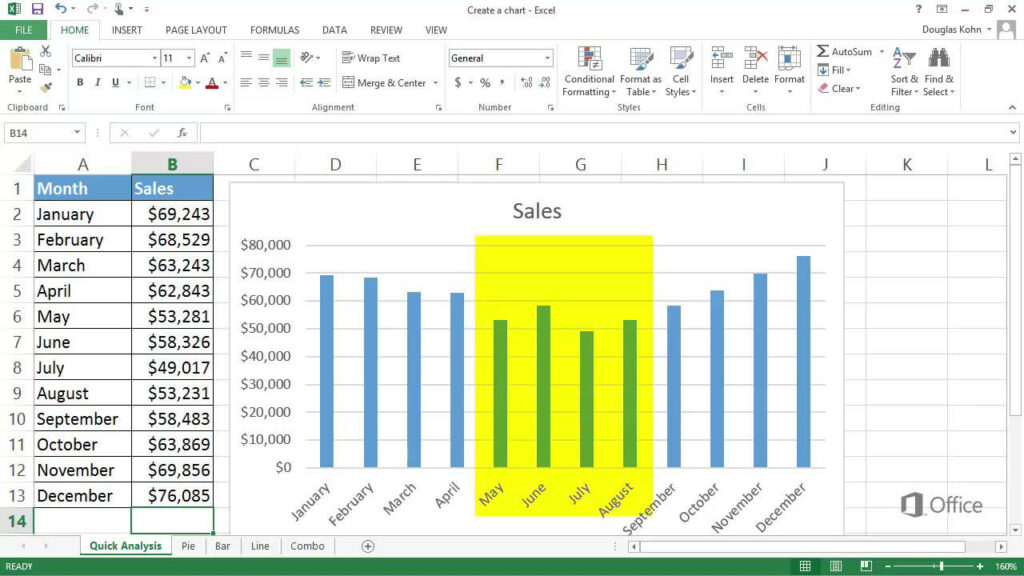
2.1 Launching Excel and Importing Data 2.2 Selecting Data for Chart Creation 2.3 Inserting a Chart: Quick Analysis vs. Chart Wizard 2.4 Choosing the Right Chart Type for Your Data
Section 3: Basic Chart Types and Their Uses
3.1 Column Charts: Comparing Data Across Categories 3.2 Bar Charts: Comparing Data Across Categories (Horizontal Bars) 3.3 Line Charts: Showing Trends Over Time 3.4 Pie Charts: Showing Proportions of a Whole 3.5 Scatter Plots: Displaying Relationships Between Two Variables 3.6 Area Charts: Showing Cumulative Totals Over Time 3.7 Histograms: Displaying Frequency Distributions
Section 4: Customizing Charts for Clarity and Impact
4.1 Formatting Chart Elements: Titles, Axes, Legends, Gridlines 4.2 Changing Chart Colors, Styles, and Effects 4.3 Adjusting Chart Layout and Size 4.4 Adding Data Labels, Annotations, and Trendlines 4.5 Using Chart Templates for Consistency and Efficiency
Section 5: Advanced Chart Customization Techniques
5.1 Adding Multiple Data Series to a Chart 5.2 Creating Combination Charts: Mixing Different Chart Types 5.3 Using Secondary Axes for Dual Y-Axis Charts 5.4 Customizing Data Labels and Axis Scales 5.5 Exploring 3D Charts and Perspective Options
Section 6: Interactive Charts with Excel Features
6.1 Adding Data Tables and Data Point Labels 6.2 Using Data Validation for Dynamic Charting 6.3 Creating Interactive Charts with Form Controls 6.4 Incorporating Hyperlinks and Drill-Down Functionality
Section 7: Tips and Best Practices for Chart Creation
7.1 Simplify Your Charts: Avoid Chartjunk and Redundant Data 7.2 Choose Appropriate Chart Types for Your Data and Message 7.3 Label Your Axes Clearly and Use Descriptive Titles 7.4 Use Consistent Color Schemes and Styles Across Charts 7.5 Test Your Charts for Accessibility and Readability
Section 8: Sharing and Presenting Charts
8.1 Copying and Pasting Charts into Other Applications 8.2 Exporting Charts as Image Files or PDFs 8.3 Embedding Charts in Reports, Presentations, and Dashboards 8.4 Printing Charts: Page Layout, Scaling, and Print Options
Section 9: Collaborative Charting with Excel Online and Office 365
9.1 Sharing Charts in Real-Time with Collaborators 9.2 Co-Authoring and Editing Charts Simultaneously 9.3 Using Comments and Annotations for Feedback 9.4 Leveraging Version History and Revision Tracking
Section 10: Troubleshooting Common Charting Issues
10.1 Dealing with Missing or Inaccurate Data 10.2 Handling Chart Formatting Errors 10.3 Resolving Chart Layout and Alignment Problems 10.4 Addressing Performance Issues with Large Data Sets
Section 11: Excel Add-Ins and Third-Party Tools for Advanced Charting
11.1 Exploring Excel Add-Ins for Specialized Chart Types 11.2 Using Power BI for Advanced Data Visualization 11.3 Leveraging Other Data Visualization Tools: Tableau, Google Data Studio, etc. 11.4 Learning from Charting Resources and Tutorials Online
Conclusion: Congratulations! You’ve now mastered the art of creating charts and graphs in Excel. By following the techniques outlined in this guide and experimenting with different chart types and customization options, you’ll be able to transform your data into compelling visual stories that inform, persuade, and inspire. Whether you’re presenting sales figures, tracking project milestones, or analyzing survey results, Excel charts and graphs empower you to convey your data insights with clarity and impact. So, embrace the power of data visualization in Excel and unlock new possibilities for success in your personal and professional endeavors.